I've used Outlook for GTD for years, currently using Outlook 2007.
I've tried many combinations of colours but 2 trends emerged - my calendar looked like a christmas tree, and colleagues didn't take me very seriously when they saw it.
I use the catagories for tasks (actions) that you might typically expect (@office, @agendas, etc) but my personal lightbulb moment was when I was rereading some of David's material on what goes on calendars:
Hard Landscape
Tickler reminders
Information relating to the day or week
So I created the following categories and I use them exclusively on my calendar:
Hard Landscape (colour grey)
Information (colour yellow)
Tickler Entry (colour green)
Vacation (color pinkish)
So my calendar is a "sea of grey" most of the week, with "all day events (time as free)" usually in green or yellow. This has stuck for over a year now. Grey might sound boring, but it caused the fewest comments from colleagues, which is worth it's weight in boredom!
*Advanced*
In repsonse to feedback from colleagues about hidden / private entries appearing in my calendar when they were trying to book meetings, I created a second calendar called "Calendar - Personal" and stuck all my personal GTD reminders in there. Lots of people's birthdays, credit card reminders, weekly reviews and out of work hours stuff that colleagues really don't care about.
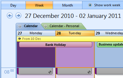
In the calendar view you can display both calendars overlaid on each other, in a merged view mode. You do this by viewing them first side by side, then clicking the arrow in the tab where it shows the calendar's name. You can do this with any number of calendars including meeting rooms, or shared team holiday booking calendars.
I've tried to use an attachment with a screen clipping here. You can see a couple of examples. The overly Purple/pink header is because the whole of Monday and Tuesday are marked as out of office. I couldn't really show more without revealing personal information - sorry!:
Have fun!
Attached files


